Within my chosen brief it was asked that I create a magazine front cover and a film poster (as mentioned in my previous drafter ancillary task post).
Whilst creating these tasks I found the magazine front cover a lot easier to make, perhaps due to the stricter conventions there was less scope for originality and creativity- a skill in which I lack. After having had some photoshop tutorials as to some of the basic available effects I was equipped with enough knowledge in order to go on and create something of a high standard. Naturally, there were certain aspects in which I lacked knowledge, however help wasn't afar, my peers and teacher were able to assist me where help was needed. For example I was introduced to the blur tool which blended my layers together nicely so they didn't look like they had simply been cut and stuck down- they looked like one piece.
Moreover the blending options within photoshop such as drop shadows created a clever effect for me as I was able to make my film magazine title look as if a spotlight was shining onto it due to the shadow behind.
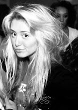
Above is the final copy of my movie magazine front cover- overall I am very pleased with the finished product, I believe it to look professional due to the incorporation of all conventions commonly seen on magazine front covers. For me, the array of fonts work particularly well in creating a musical high school feel, fitting the genre. Becca (the singer) has been placed in the foreground to highlight her importance in the film. Every image on the front cover is iconic of fame and the musical genre. Teasers and a puff again take into consideration the conventions.

On creating my film poster I found it a lot harder to come up with a design which worked well and looked professional as a poster. A peer showed me a brush available for download for photoshop which created a spotlight effect which then gave me inspiration for the poster I ended up creating. Similar to the magazine cover I have used my three main characters of the film as part of the poster again posing related to their speciality. As mentioned on the ancillary tasks mock up I have included titles from the trailer to give more of an insight into the film as well as the release date and logos of the production companies. Again I am pleased with the finished look of this text. I created another poster with a similar look, however more boxed, which I then showed both to my class mates and teacher who all felt the piece above was more together and looked more professional.