Having recently been out on another shoot, re shooting mainly the first piano sequence in order to capture a range of different shot styles and lengths, back into the editing suite fitting it together in an effective and capturing way. In addition to this further musicality shoots of the other main characters and additional characters within the "film".
Audio- where do I start, its near impossible to find any good/worthwhile bits of audio and music, thankfully I choose to record an artist for some of my audio. Finding a balance between cheesy and boring is proving difficult, however after long and hard searching on the saviour that is freeplaymusic I managed to find some pieces of audio that I am relatively happy with.
Titles are a continuing working progress, with the knowledgable help of peers with software such as flash slowly but surely some professional looking titles are on their way to completion.
After showing my work to my teacher I was given some essential feedback in which I can go on and improve my piece further in order to try and acheive the best possible grade. 1) organise a group shoot... it was felt that an audience shot within my trailer would be effective and therefore it is necessary for me to liase with the drama department to set up lighting in the hall, try and round up a largre amount of people to capture some panning, audience reaction shots and also final performance shots. 2) Record audio separately, and link in with video at a later stage, finally 3) record my voiceover to accompany my titles.
I hope to have this next stage completed sometime next week.
26 January 2010
Secondary Research- Magazine Front Covers
I approched this secondary research in the same way as I did with the film posters, through searching the web and textbooks.
Magazine front covers take on the role of encouraging the consumer to pick up the issue and ultimately buy it, combined conventions common on various magazine front covers over various different genres are evident, differing only slightly in order to suit their niche audience.
Common Conventions Listed in: OCR GCSE Media Studies- 2002
Masthead= title of the magazine
Plugs/cover/sell lines/teasers= words and phrases giving information about what is inside the magazine.
Puff= tagline of the magazine, usually under the masthead, it "puffs up" the magazines status
Individual Words= Used to attract attention
Terms used to connect with the reader
Shadowing= black edging given to different parts of the text to creat certain effects.
Primary research- Magazine Front Covers

Textual Analysis:
Empire Magazine-
- Masthead placed at the top centre of the magazine in order to make the reader fully aware of what magazine it is.
- The colour of the masthead (red) could predomantly be targetting a male audience, this idea reinforced through the male image dressed in army uniform and surrounded by a firey explosion and a gun. Representing action, typically enjoyed most by the male gender.
- Individual words have been used in order to attract the readers attention: "NEW" "PLUS", creating the feeling that you are getting more than you paid for.
- The puff situated below the masthead "puffs up" the magazines status, 'The Worlds Biggest Movie Magazine'.
- Teasers placed around the edges of the magazine insight the reader into whats inside the issue, more encouragment to by the issue.
- Short snappy phrases make it easier and wuicker to digest the information.
- The front cover takes on colours and elements of war, army/war associated colours browns and greens along with a target containing text.
- MS/LS photograph of Matt Damon in character, his head covering part of the masthead showing that it is a well established magazine.
-Film terms have been used in order to connect with the reader: "week on location", "on set access".
Total Film Magazine:
-Masthead is located top centre of the magazine, partially covered by the head of the main featured photograph, establishing the high status of the magazine.
- Individual words such as "FREE", "PLUS", "STARRING", entice the reader and ultimately encourage a sale.
- Colour co-ordination matches well together, mainly purples, whites and yellows.
- Photograph of the main feature character has been photographed as on screen with on screen surroundings.
- Language such as 'massive' and 'exclusive' entice the reader further creating a sense of getting more than you have paid for.
- Teasers have been placed on the LHS of the magazine leaving the photograph as a main focus.
- Free giveaway notice about masthead.
- Colours used attract both a male and female audience.
Cine World UNLIMITED Magazine:
- Masthead placed at the top to establish what magazine it is, company logo placed top right to further establish its origin due to less developed status in comparison to the other two magazines, similarly why the masthead is completely visible.
- Individual terms such as "FREE" to encourage the reader to pick up a copy.
- Feature photograph characters within top film of the month.
- Free lance work thus limited teasers, title of hit film accompanied with a teaser.
- Colour scheme red black and white, common convention within film magazines.
- Symmetrical front cover, separate information blocked off neatly in different sections.
Secondary Research- Film Posters
After research on the web and within different textbooks it became apparent that the job of a film poster is that "which occupys a space between art and advertising, it has a clear commercial purpose- to promote. In addition an element of artistic value."- mediaknowall.com
Common conventions noted:
- Written language
- Typography
- Photographs and illustrations
- Lighting
- Camera Angle
- Shot Size
- Visual composistions
- Colour
- Body language
- Cropping
24 January 2010
Film poster textual analysis- Hairspray
Hairspray (2007):
- Similarly to the Fame poster the characters have been split up into different sections of the poster, the larger their given space, the larger their importance, however not necessarily within the film but instead their celebrity status within reality in order to entice an audience by advertsising a great film cast.
- Bright colours within representing the mise en scene within the film, dated costumes reflect the time period.
- The characters facial expressions are that of which represent themselved on screen.
- Shapes within, circles, iconic of fame- spotlights, a huge aspiration within the film.
- Title of film placement bottom centre, also included are names of main stars, release date and names and logos of those involved within the production.
- Characters faces are lit up, white lighting surrounding them, emphasises the characters hair- key to storyline.
- Sans serif font, taking away formal effect, more fun. Similar within every poster analysed and thus relfecting the genre.
Film poster analysis contd- High School Musical
High School Musical 3:
 - Main characters have been photographed within the foreground emphasising their importance within the film.
- All are jumping in the air, smiling and looking happy with life, presents a positive image of the text.
- Good colour co-ordination has been used, costumes match the colours used within the title of film, red and black connoting love and perhaps challenges.
- Elements of the poster are symbolic of the plot, the graduation uniform, central to storyline.
- Costumes and colour choices for particular characters reflects personality traits, white on Gabriella, reflecting her innocence.
- Title of the film placed bottom centre along with the release date "IN CINEMAS...", names and logos of those involed with production etc.
- The white background reinforces the lightness and happy atmosphere.
- Sans serif font presents an easy going fun feeling, reflecting the genre.
Ancillary task research commences- Film poster textual analysis
Textual Analysis:
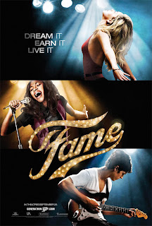
Fame-
Fame-

- The poster is split up into 3 sections, presenting different aspects of fame, dance, singing and music.
- Clever use of lighting, dark shadows surrounding the characters emphasising the fact that they are lit up by spotlights, iconic of fame.
- Symetrical piece, 3 sections, 3 pieces of text "dream it, live it, earn it" similar typography to titles within trailer .
- Title of the film is central within the poster thus easily recogniseable/ well established for the audience.
- Date of release embedded in the bottom left hand corner, small text along with the film website and production company logos.
- Main colour is black, suggesting dark connotations surround fame and everything it is.
- Characters have been photographed as a MS body language showing intent focus on what they are doing. Their separation reinforces that everyone is for their own.
11 January 2010
Snow, Christmas and MORE snow!
So, its been a good two months until any progress has been made, with the snow, christmas holidays and then more snow it has proved impossible to re shoot any footage due to my main filming location, school which has been closed, and hindered transport because of 'treacherous driving'.
I plan to re-shoot most of my shoots tomorrow after school, provided all actors/actresses needed are available, fingers crossed!
It has proved difficult for me to find audio that I am happy with, in addition editing it to a high standard making use of sound booth for a higher quality finish, also due to my lack of skills it is proving hard to do.
Currently I am in the process of creating my titles, using a spotlight effect across the text in order to portray the fame/musical idea.
I hope to have my re-shoots and in placement by this time next week!
Subscribe to:
Posts (Atom)


