22 March 2010

Before Evaluating

On evaluating my products, its vital to gain audience feedback, in order to do this I will employ various methods, firstly I will create a questionnaire in which to record the information. Due to the visual being a movie, interactive methods will be essential. One way will be to upload the video to facebook, along with the questionnaire, inviting people to view the trailer and then answer the questionnaire and either message or email me their responses. Secondly, I plan to arrange a viewing one lunch time in school with 30 people who after watching can fill in the questionnaire. Lastly, should these methods fail and only provide me with limited responses I will paste the link of the video to watch on youtube in facebook status’s and on twitter asking people to leave their comments and opinions.

After this process I will began the evaluation stage.

17 March 2010

Steps before completion

Before submitting my final task I wanted to add some finishing touches in order to finish with the best possible quality. After having seen some work from students doing PVA I noticed the use of a cinematic effect on some of the shots. I wanted to adapt this style into my own work in order to follow the conventions of a Hollywood style film aimed for an audience of children and young adults. By searching on youtube I was able to find some tutorials on how to create the specific effect. I was pleased with the final finish- however some of the poorer quality shots once changed didn’t look as professional as others.

I took on the advice given from my teacher in the need to quicken the pace. This was achieved through carefully establishing where the major beats are and then cutting the shots to the beat of the soundtrack to give an up-tempo feel.

Overall, I am satisfied with the finished product, however given the chance I may have chosen a different genre to focus with as for me, I feel the trailer lacks a solid narrative.

Final Cut of Seeking Stardom Trailer


9 March 2010

Production Stage-Main Task- 07/03/10

With regards to the main task, the deadline is looming and finally I can begin to see the light at the end of the tunnel. Main struggles have included finding a soundtrack appropriate for the genre, one that peaks and troughs in the right places and creates depth to the trailer.
Good sources of copyright free music are not exactly the easiest thing to locate- especially for the genre of my trailer. Just as I was giving up all hope, after having trawled through freeplaymusic.com searching myspace.com for unsigned hip hop/r&b music, asking teachers within the music department and even resorting to garageband I managed to find a track from freeplaymusic.com that I had downloaded a couple of months back. Thankfully it did everything I wanted it to- I just hope it goes down well with my teacher.

In addition I have recorded a voiceover to accompany the titles within the trailer, with the idea in mind to subvert conventions I recorded a voiceover with a scottish accent. I also recorded the traditional american hollywood voiceover, I am yet to hear back from teacher as to which one I should use.

Lastly, I believe a range of shots have been covered and therefore filming is now no longer necessary and has come to a close. On this journey through the creating stages I have become more accustomed to programmes such as premier and I am particularly pleased with my improvement with the use of photoshop.


Creating the Ancillary Tasks


Within my chosen brief it was asked that I create a magazine front cover and a film poster (as mentioned in my previous drafter ancillary task post).
Whilst creating these tasks I found the magazine front cover a lot easier to make, perhaps due to the stricter conventions there was less scope for originality and creativity- a skill in which I lack. After having had some photoshop tutorials as to some of the basic available effects I was equipped with enough knowledge in order to go on and create something of a high standard. Naturally, there were certain aspects in which I lacked knowledge, however help wasn't afar, my peers and teacher were able to assist me where help was needed. For example I was introduced to the blur tool which blended my layers together nicely so they didn't look like they had simply been cut and stuck down- they looked like one piece.
Moreover the blending options within photoshop such as drop shadows created a clever effect for me as I was able to make my film magazine title look as if a spotlight was shining onto it due to the shadow behind.

Above is the final copy of my movie magazine front cover- overall I am very pleased with the finished product, I believe it to look professional due to the incorporation of all conventions commonly seen on magazine front covers. For me, the array of fonts work particularly well in creating a musical high school feel, fitting the genre. Becca (the singer) has been placed in the foreground to highlight her importance in the film. Every image on the front cover is iconic of fame and the musical genre. Teasers and a puff again take into consideration the conventions.


On creating my film poster I found it a lot harder to come up with a design which worked well and looked professional as a poster. A peer showed me a brush available for download for photoshop which created a spotlight effect which then gave me inspiration for the poster I ended up creating. Similar to the magazine cover I have used my three main characters of the film as part of the poster again posing related to their speciality. As mentioned on the ancillary tasks mock up I have included titles from the trailer to give more of an insight into the film as well as the release date and logos of the production companies. Again I am pleased with the finished look of this text. I created another poster with a similar look, however more boxed, which I then showed both to my class mates and teacher who all felt the piece above was more together and looked more professional.

15 February 2010

Ancillary Mock Up's


Above is a very basic mock up of how I propose my magazine front cover to look like.

I will photograph or take a screen grab or the three main characters from the film in role as this was a common convention within movie magazine front covers.

I aim to partially cover the masthead in order to create some establishment and take away the idea that a student has created this piece of work.

Various teasers will be placed around the edge of the frame along with a puff.


To the right is another brief mock up, but of my film poster. Within I will include the three main characters in the film striking a pose related to their speciality. I plan to use a spotlight effect in order to highlight elements of fame. Moreover I will include titles from the trailer in order to give more of an insight as to what the film is about.
I plan the placement of the film title to be in the middle as to be easily recognisable for the audience, furthermore the font for this text will be that used in the trailer to create familiarity and association across all three texts.


Trailer Rough Cut to Date

Below is the rough cut of my trailer to date- I have recently shot more footage in which I will add and change certain parts of the trailer. I envisage to add in some audience footage, as well as record a voiceover for the titles.
In order to be able to upload the file at a quick pace the quality in which I have exported the file is very low, hindering the overall look of the piece so far.

26 January 2010

Production Stage- 26/01/10

Having recently been out on another shoot, re shooting mainly the first piano sequence in order to capture a range of different shot styles and lengths, back into the editing suite fitting it together in an effective and capturing way. In addition to this further musicality shoots of the other main characters and additional characters within the "film".

Audio- where do I start, its near impossible to find any good/worthwhile bits of audio and music, thankfully I choose to record an artist for some of my audio. Finding a balance between cheesy and boring is proving difficult, however after long and hard searching on the saviour that is freeplaymusic I managed to find some pieces of audio that I am relatively happy with.

Titles are a continuing working progress, with the knowledgable help of peers with software such as flash slowly but surely some professional looking titles are on their way to completion.

After showing my work to my teacher I was given some essential feedback in which I can go on and improve my piece further in order to try and acheive the best possible grade. 1) organise a group shoot... it was felt that an audience shot within my trailer would be effective and therefore it is necessary for me to liase with the drama department to set up lighting in the hall, try and round up a largre amount of people to capture some panning, audience reaction shots and also final performance shots. 2) Record audio separately, and link in with video at a later stage, finally 3) record my voiceover to accompany my titles.

I hope to have this next stage completed sometime next week.

Secondary Research- Magazine Front Covers

I approched this secondary research in the same way as I did with the film posters, through searching the web and textbooks.

Magazine front covers take on the role of encouraging the consumer to pick up the issue and ultimately buy it, combined conventions common on various magazine front covers over various different genres are evident, differing only slightly in order to suit their niche audience.

Common Conventions Listed in: OCR GCSE Media Studies- 2002

Masthead= title of the magazine

Plugs/cover/sell lines/teasers= words and phrases giving information about what is inside the magazine.

Puff= tagline of the magazine, usually under the masthead, it "puffs up" the magazines status

Individual Words= Used to attract attention

Terms used to connect with the reader

Shadowing= black edging given to different parts of the text to creat certain effects.

Primary research- Magazine Front Covers


Textual Analysis:
Empire Magazine-
- Masthead placed at the top centre of the magazine in order to make the reader fully aware of what magazine it is.

- The colour of the masthead (red) could predomantly be targetting a male audience, this idea reinforced through the male image dressed in army uniform and surrounded by a firey explosion and a gun. Representing action, typically enjoyed most by the male gender.

- Individual words have been used in order to attract the readers attention: "NEW" "PLUS", creating the feeling that you are getting more than you paid for.

- The puff situated below the masthead "puffs up" the magazines status, 'The Worlds Biggest Movie Magazine'.

- Teasers placed around the edges of the magazine insight the reader into whats inside the issue, more encouragment to by the issue.

- Short snappy phrases make it easier and wuicker to digest the information.

- The front cover takes on colours and elements of war, army/war associated colours browns and greens along with a target containing text.

- MS/LS photograph of Matt Damon in character, his head covering part of the masthead showing that it is a well established magazine.

-Film terms have been used in order to connect with the reader: "week on location", "on set access".

- Barcode has been placed at the bottom right.


Total Film Magazine:
-Masthead is located top centre of the magazine, partially covered by the head of the main featured photograph, establishing the high status of the magazine.

- Individual words such as "FREE", "PLUS", "STARRING", entice the reader and ultimately encourage a sale.

- Colour co-ordination matches well together, mainly purples, whites and yellows.

- Photograph of the main feature character has been photographed as on screen with on screen surroundings.

- Language such as 'massive' and 'exclusive' entice the reader further creating a sense of getting more than you have paid for.

- Teasers have been placed on the LHS of the magazine leaving the photograph as a main focus.

- Free giveaway notice about masthead.

- Colours used attract both a male and female audience.


Cine World UNLIMITED Magazine:
- Masthead placed at the top to establish what magazine it is, company logo placed top right to further establish its origin due to less developed status in comparison to the other two magazines, similarly why the masthead is completely visible.
- Individual terms such as "FREE" to encourage the reader to pick up a copy.
- Feature photograph characters within top film of the month.
- Free lance work thus limited teasers, title of hit film accompanied with a teaser.
- Colour scheme red black and white, common convention within film magazines.
- Symmetrical front cover, separate information blocked off neatly in different sections.


Secondary Research- Film Posters


After research on the web and within different textbooks it became apparent that the job of a film poster is that "which occupys a space between art and advertising, it has a clear commercial purpose- to promote. In addition an element of artistic value."- mediaknowall.com

Common conventions noted:
- Written language
- Typography
- Photographs and illustrations
- Lighting
- Camera Angle
- Shot Size
- Visual composistions
- Colour
- Body language
- Cropping

24 January 2010

Film poster textual analysis- Hairspray

Hairspray (2007):
- Similarly to the Fame poster the characters have been split up into different sections of the poster, the larger their given space, the larger their importance, however not necessarily within the film but instead their celebrity status within reality in order to entice an audience by advertsising a great film cast.

- Bright colours within representing the mise en scene within the film, dated costumes reflect the time period.

- The characters facial expressions are that of which represent themselved on screen.

- Shapes within, circles, iconic of fame- spotlights, a huge aspiration within the film.

- Title of film placement bottom centre, also included are names of main stars, release date and names and logos of those involved within the production.

- Characters faces are lit up, white lighting surrounding them, emphasises the characters hair- key to storyline.

- Sans serif font, taking away formal effect, more fun. Similar within every poster analysed and thus relfecting the genre.

Film poster analysis contd- High School Musical

High School Musical 3:
- Main characters have been photographed within the foreground emphasising their importance within the film.
- All are jumping in the air, smiling and looking happy with life, presents a positive image of the text.

- Good colour co-ordination has been used, costumes match the colours used within the title of film, red and black connoting love and perhaps challenges.

- Elements of the poster are symbolic of the plot, the graduation uniform, central to storyline.

- Costumes and colour choices for particular characters reflects personality traits, white on Gabriella, reflecting her innocence.

- Title of the film placed bottom centre along with the release date "IN CINEMAS...", names and logos of those involed with production etc.

- The white background reinforces the lightness and happy atmosphere.

- Sans serif font presents an easy going fun feeling, reflecting the genre.


Ancillary task research commences- Film poster textual analysis

Textual Analysis:

Fame-


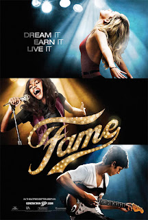
- The poster is split up into 3 sections, presenting different aspects of fame, dance, singing and music.
- Clever use of lighting, dark shadows surrounding the characters emphasising the fact that they are lit up by spotlights, iconic of fame.
- Symetrical piece, 3 sections, 3 pieces of text "dream it, live it, earn it" similar typography to titles within trailer .
- Title of the film is central within the poster thus easily recogniseable/ well established for the audience.
- Date of release embedded in the bottom left hand corner, small text along with the film website and production company logos.
- Main colour is black, suggesting dark connotations surround fame and everything it is.
- Characters have been photographed as a MS body language showing intent focus on what they are doing. Their separation reinforces that everyone is for their own.

11 January 2010

Snow, Christmas and MORE snow!

So, its been a good two months until any progress has been made, with the snow, christmas holidays and then more snow it has proved impossible to re shoot any footage due to my main filming location, school which has been closed, and hindered transport because of 'treacherous driving'.

I plan to re-shoot most of my shoots tomorrow after school, provided all actors/actresses needed are available, fingers crossed!

It has proved difficult for me to find audio that I am happy with, in addition editing it to a high standard making use of sound booth for a higher quality finish, also due to my lack of skills it is proving hard to do. 

Currently I am in the process of creating my titles, using a spotlight effect across the text in order to portray the fame/musical idea.

I hope to have my re-shoots and in placement by this time next week!  

9 November 2009

ILP Day- rough cut completion

The ILP day proved a great opportunity to complete my entire rough cut. I arranged for all my actors/actresses to come to school- thankfully they were all available at some point during the day- I managed to complete all of the filming I needed to get done.

Having to re-shoot in the school hall meant I needed to change the settings on the camera to ensure a good quality shoot, I found the correct setting for the lighting in the hall and the outcome was a high quality shot. There was no problem with filming and due to it being an ILP there was a dance workshop which I was able to film and perhaps use some if this footage within the trailer. However due to most of the school space being taken up by classes I was unable to shoot within the drama studios and only had the hall available to me for a limited amount of time. Nevertheless I was still able to complete all of the shots that I needed to get done.

During lunch time I rounded up a group of friends which I then filmed in one of the classrooms, I was lucky to be able to get a number of people at once as this was one of the shots I was dreading to film due to the direction of a large number of people, however I managed to get the desired shot I wanted concluding my filming for the day.

Into the editing suite with all my new footage, choosing appropriate shots and editing the footage into my anamatic in order to have a clear idea in my head the order of each shot. Thankfully I already had most of the sounds/music needed for my trailer which shortened the process when completing my rough cut. Obviously when producing my final piece I will need to improve the quality of the sounds, especially the voiceover, which I have decided to use Mr Smith, one of the drama teachers in school, provided he consents.

Filming at Becky High

With the gained knowledge that there were various different settings on the camera which could overcome my problem of lighting I went out again to film. My third actress from a different school enabled me to have another school location to film in. We were granted permission to film in their school which meant I had a range of different environments which would fit in well with the conventions of my trailer.

I used their school hall which has a grand piano where I shot the piano shots of Becca. Luckily due to Becca being a music student we gained access to the music rooms and recording studio- perfect locations for the genre of my trailer, musical.

The lighting at Becky High was a lot better which meant I didn't have to change the settings on the camera at all, but it will be good to know for when I re-shoot the shots in my own school hall.

Pleased with the range of shots I was able to film we wrapped filming up for the evening. Leaving me with the objectives on the ILP day to shoot any group shots, put together and edit my rough cut as far as possible.

4 November 2009

Filming commences

The start of filming- last week I started to shoot a range of shots, luckily enough with the new HD panasonic cameras. 

During half term I came into school with the only available actress, which proved hindering as I was only able to shoot a limited amount of shots. Nevertheless it was a start- the advantage of using the school during half term meant that every location I needed to film in was available and empty, speeding up the process. 

However I was dissatisfied with the quality of the shots- the lighting available in school was atrocious, I was hoping that once I had uploaded the footage it would be of a higher quality, an evidently wrong assumption.

Once I had uploaded the footage the quality was below acceptable and therefore made it imperative for me to shoot again.

Back to school and finding the time that was perfect for everyone continued to be difficult. Time for me to go out and shoot my second actor (I adopted the process whereby I focused on the actor/actress separately and shot any shots which was solely themselves, later I would focus on the group shots. It was easier this way as it didn't waste time and also proved easier for one person to be available rather than a group all at the same time.) 

The second time out filming presented me with the same problem LIGHTING, moreover in the hall, which consequently lead me to poor quality footage, I decided to shoot outside, the natural lighting meant that the quality of the shots were pristine.

Back into the editing suite, with more poor quality footage- confused as to how I was going to overcome this problem one of my peers suggested I play around with the camera settings (why had I not thought of this before?!) 

With the footage I had- that was worthy, I uploaded it into iMovie at first on one of the apple laptops where iMovie kept crashing unexpectedly which meant I had to use one of the comptuers instead, which thankfully worked, this footage I then imported it into premier. I started to play around with the shots, using my anamatic as a guide as to whereabouts each shot needed to be placed. I endeavored to complete the rest of my filming during the ILP day and then hopefully also complete my rough cut in time for the deadline. 

18 October 2009

Shooting Schedule- Key points to consider

In the decision to re-organise my pre-production process, instead of working in a linear sequence which isn't proving to be particulay effective, its important for me to consider how aspects are connected in order to tackle a variety of features at the same time and thus work more efficently and quickly.


One way I will do this is by starting to create my titles within the trailer rather than leaving them until I have filmed all my footage, by doing this it will give me time to experiment with different styles to see which ones work the best.


My anamatic has proved aspects of mise-en-scene lack colour, showing a subversion within my chosen genre- purely accidental. Rob Mclnnes for Mediamagazine -"The bright colour palette of the mise-en-scene remains a feature of many high school movies." Once I commence with filming I will adhere to this convention as I believe it is imperative in order to make the trailer more exciting.


Shooting Schedule:


- ( to be scanned in)